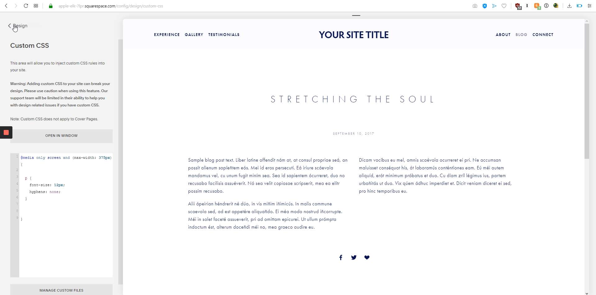
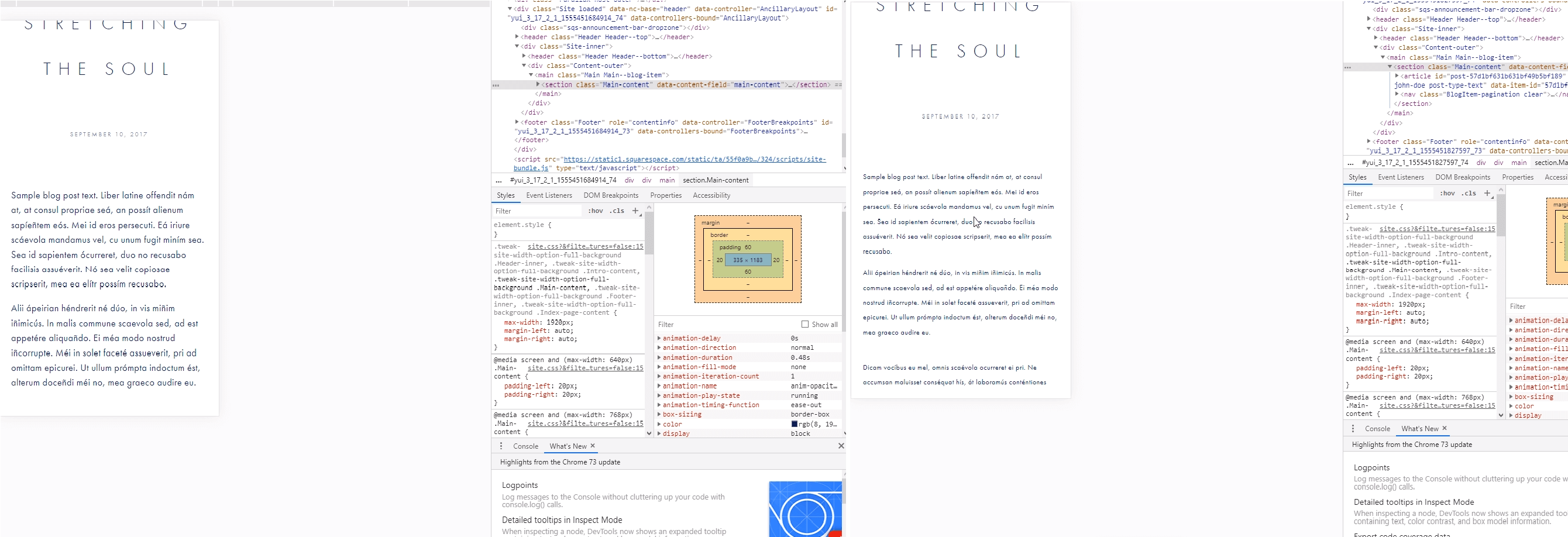
The question now is how to change the font size and make it less hyphenated on mobile screens. We'll do this on Squarespace; go to "Design" and then click on "Custom CSS". We're gonna write a code on the white box that will affect the involved screens. For iPhone 6 you can see the width of the screen is 375px. Write open and closing curly braces, type the code that will affect the paragraphs and edit the font size and hyphenation, then click on save and the changes can be seen in the size of the font and the absence of hyphens.
Squarespace tutorial: Change font size and remove hyphens on mobiles
Step 1: Go to “Design”

First of all, you have to open your Squarespace left Panel and click on “Design”.
Step 2: Go to “Custom CSS”

Now, some new options will be displayed, here you have to click on "Custom CSS" to add a code.
Step 3: Enter the code

The code is the following:
@media only screen and (max-width: 375px)
{
p {
font-size: 12px;
hyphens: none;
}
}
Step 4: Save the changes and refresh your site

Once that all steps have been followed correctly, the font size will be changed and the hyphens will be removed for mobile devices.


.png)
